
Most people assume that transforming a room means a full renovation, a significant budget, and weeks of disruption. But the truth is that some of the most dramatic shifts in how a space looks and feels come from changes that cost very little and take almost no time at all.
Experienced interior designers know this well. Before any major project begins, before the furniture is sourced and the finishes are selected, there is always a conversation about the fundamentals: light, proportion, colour, layering. Get these right and a room feels alive. Get them wrong and even the most expensive furniture will sit in a space that feels flat and uninspired.
The eight changes in this guide are grounded in those same fundamentals. Some are about adding something new. Some are about removing things that are quietly working against the room. All of them have a disproportionate effect on how a space looks and feels, which is exactly what makes them worth understanding.
1. Switch Your Lighting Layers
Lighting is the single most underestimated element in any room. Most homes rely almost entirely on one overhead light source, and that single decision does more damage to a space than almost anything else. Overhead-only lighting flattens a room. It removes shadow and depth, makes ceilings feel low, and gives everything a slightly clinical quality that no amount of beautiful furniture can overcome.
The fix is to layer your light sources. This means combining three types of lighting in the same room: ambient light (the general fill light that replaces your single overhead), task light (focused light for reading, working, or cooking), and accent light (light that draws attention to specific objects, walls, or architectural features). Together they create a room that looks different at different times of day and feels genuinely considered.
In practical terms this means adding a floor lamp in a corner that currently sits in shadow, placing a table lamp on a console or side table, or installing wall sconces that wash light upward rather than downward. None of these changes require rewiring. Most require nothing more than a plug socket and an afternoon.
The other lighting change that transforms a room immediately is switching to warm-toned bulbs. A colour temperature of around 2700K gives a room a soft, golden quality that feels welcoming and relaxed. Cooler, bluer light above 4000K works well in kitchens and bathrooms where clarity matters, but in living spaces and bedrooms, warm light is almost always the right choice.
| The rule of thumb: if you can see the light source directly, it is working against you. Shade it, diffuse it, or redirect it. |
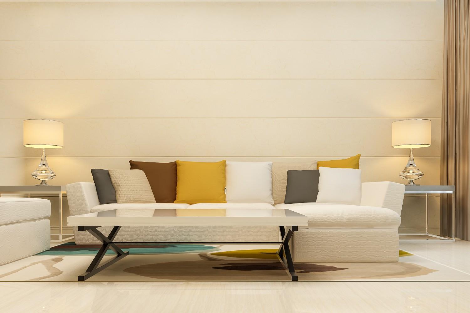
2. Hang Your Curtains Higher and Wider
This is one of the most effective changes in interior design and one of the most commonly ignored. Where curtains are hung makes an enormous difference to how tall and proportioned a room feels.
The standard approach is to hang curtains just above the window frame, at the width of the window. The result is that the curtains emphasise the window as a feature rather than the wall, and the room feels exactly as tall as it actually is. The designer approach is different: hang curtains as close to the ceiling as possible, and extend the rod well beyond the window frame on both sides, typically 20 to 30 centimetres beyond each edge.
What this does is remarkable for such a simple change. The eye follows the curtain upward to the ceiling rather than stopping at the top of the window, which makes the ceiling read as higher. The curtains, when open, stack to the sides of the window rather than in front of it, which maximises the light entering the room and makes the window appear significantly wider than it actually is.
For maximum effect, choose curtains that pool very slightly on the floor rather than stopping at the sill or floating above it. Floor-length fabric has a luxurious, considered quality that instantly elevates the room, and it reinforces the vertical line that draws the eye upward.
3. Reposition Your Furniture Away from the Walls
Walk into almost any living room that has been arranged without professional input and you will find every piece of furniture pushed hard against the walls. Sofas against the back wall, armchairs in the corners, side tables tucked in tight. It feels logical because it seems to maximise the floor space in the centre of the room. In practice, it does the opposite.
When furniture is pushed to the perimeter, the room feels disconnected and the centre of the space looks empty and awkward. The furniture has no relationship with itself or with the room. Pulling pieces inward and toward each other creates a conversation area: a defined zone where people naturally gather, which gives the room a sense of purpose and human scale.
For a living room, start by pulling the sofa away from the wall by 30 to 60 centimetres. Position armchairs at a slight angle rather than squared off. Bring a rug in beneath the seating group to anchor it visually. The floor space you lose in the centre is replaced by a room that actually feels larger because it is organised rather than scattered.
This principle applies equally in bedroom design. A bed that floats in the room with space on both sides feels more intentional and more comfortable to use than one pushed into a corner. Even in smaller rooms, the visual benefit of a properly positioned bed outweighs the practical inconvenience of losing a few centimetres on one side.
4. Add One Large Mirror in the Right Place
Mirrors are one of the few design elements that do several jobs at once. They reflect light, making a room feel brighter without any additional light source. They create the impression of depth, making a wall visually recede. And when placed well, they add a sense of height and openness that changes the entire character of a space.
The most impactful placement is usually opposite or adjacent to a window, where the mirror captures and bounces natural light back into the room. A large mirror on a wall that receives no direct light does very little. Position it where it reflects the window or a lamp and it amplifies that light source significantly.
Size matters here more than most people expect. A small mirror on a large wall looks like an afterthought and has almost no effect on the feel of the room. A mirror that fills a significant portion of the wall, or at minimum reaches from hip height to close to the ceiling, reads as an intentional design decision and delivers the spatial effect that makes this change worthwhile.
Lean large floor mirrors against the wall rather than mounting them for a more relaxed, contemporary feel that also avoids making permanent changes to the wall surface.
5. Declutter, Then Edit What Comes Back
Every room has a version of itself that is the best it can possibly look. Clutter is what stands between most rooms and that version. This is not about minimalism as a style choice. It is about understanding that every object in a room requires visual processing from everyone who enters it, and there is a point at which the brain simply stops registering individual things and starts reading the whole room as busy and overwhelming.
The process has two distinct steps and both matter. The first is removing everything that does not actively contribute to the room. Not reducing, not tidying, but removing. Take it out of the room entirely and live with the space without it for a few days. The second step is editing what comes back. Not everything deserves to return. What earns its place back in the room is something that either serves a practical purpose, has genuine personal meaning, or is beautiful enough to deserve the visual attention it asks for.
When you do bring objects back, group them intentionally. Three objects of different heights placed together read as a considered arrangement. The same three objects scattered randomly across a surface read as clutter. The objects have not changed. The difference is entirely in how they are organised.
| The edit rule: if you cannot describe in one sentence why an object is in the room, it probably should not be there. |
6. Introduce Texture Through Soft Furnishings
A room can have beautiful colours and good proportions and still feel somehow flat or incomplete. When this happens, the missing element is almost always texture. Texture is what gives a room visual and physical warmth, and it is what makes the difference between a space that looks like it has been styled and one that feels genuinely lived in and comfortable.
The easiest and most affordable way to introduce texture is through soft furnishings: cushions, throws, rugs, and curtains. But the texture of the fabric itself matters as much as the colour or pattern. Linen has a matte, slightly rough quality. Velvet has depth and light absorption that changes with the angle of view. Wool and boucle have a warmth and irregularity that feels organic and inviting. Natural materials like rattan, jute, and woven grass bring an earthy texture that grounds a space.
In a living room, a linen sofa with velvet cushions and a textured wool throw reads as layered and considered even if the colours are all neutrals. In a bedroom, a mix of linen bedding, a tactile rug on one or both sides of the bed, and a throw across the foot creates the kind of layered warmth that makes the room feel genuinely restful.
Avoid the trap of matching textures. A room where all the soft furnishings are the same material, even a beautiful one, reads as flat. The contrast between different textures is what creates the visual richness.
7. Bring in One Piece of Living Greenery
Plants have an effect on a room that is genuinely difficult to replicate with any other design element. A single well-chosen plant in the right position introduces life, organic shape, and colour in a way that feels immediate and natural rather than designed. It also has a measurable effect on how people feel in the space, which is perhaps why plants have been a consistent feature of interior design across every era and style.
The key is scale and placement. A small plant on a shelf does very little for a room. A large plant, something at floor level that reaches above table height, becomes a genuine design element. A fiddle leaf fig, a monstera, an olive tree, or a large palm placed in a corner or beside a sofa becomes as compositionally important as a piece of furniture.
Placement matters too. A plant in front of a window, where it is backlit by natural light, reads very differently from the same plant placed in a dark corner. The light through the leaves creates a quality that is both beautiful and organic, and it draws attention to the window as a light source in a way that enhances the room rather than competing with it.
For outdoor areas, the same principle applies at a larger scale. The guide to landscape and outdoor design covers how greenery is used to create structure, privacy, and atmosphere in outdoor spaces, and many of those principles translate directly into indoor plant placement.
8. Change the Colour of One Wall or Add a Dark Accent
This is the change that people resist most and regret least. Painting every wall in a room the same neutral colour is safe, and safety in interior design produces rooms that feel neither good nor bad. They simply feel like nothing in particular.
Introducing a darker or more saturated colour on a single wall does something that full-room colour cannot: it creates depth and contrast that makes the other walls, and the furniture against them, appear more clearly defined. It gives the room a focal point. And it creates the sense that the space has been considered rather than simply painted.
The most effective applications are behind a bed in a bedroom, behind a sofa or fireplace in a living room, or on the wall at the end of a corridor or entrance hall. These are the walls that the eye naturally lands on, and adding colour there feels intentional rather than arbitrary.
Dark colours, particularly deep greens, warm charcoals, and rich terracottas, work especially well in rooms that already have good natural light. They create a sense of enclosure and intimacy that makes the room feel more like a destination than a transit space. In Dubai’s predominantly warm, bright interiors, a dark accent wall provides exactly the kind of contrast and depth that the light, neutral palette of most apartments needs to feel complete.
If a full wall feels like a commitment, a painted arch, a geometric panel, or a section of limewash or textured paint achieves the same depth effect with less coverage. The underlying principle is the same: contrast and intentionality make a room feel designed rather than simply furnished.
| The simplest test: stand in the doorway of any room in your home and ask yourself what your eye lands on first. If the answer is nothing in particular, the room needs a focal point. This change creates one. |
One More Thing: The Order Matters
These eight changes are most effective when they build on each other rather than being applied randomly. Light first, because everything else is seen through the quality of the light in the room. Then proportion and furniture arrangement, because no amount of styling will rescue a room with poor spatial organisation. Then the layering of texture, colour, and living elements on top of a foundation that is already working.
If you find yourself making these changes and the room still does not feel right, the issue is usually something more fundamental: the furniture is the wrong scale for the space, the proportions of the room need addressing, or the bones of the design need reconsideration. That is when it is worth having a proper conversation with a designer. A single consultation can identify what is actually working against a space more accurately than months of iterative changes.
If you are thinking about a more considered approach to a room or a whole home, the residential design service covers everything from a single room refresh to a full home project. And if you want to see what considered design looks like in practice, the projects gallery shows completed residential and commercial work across a range of styles and scales.
Final Thoughts
The rooms we feel best in are almost never the ones that had the most money spent on them. They are the ones where someone paid attention to light, scale, texture, and the relationship between things. Those qualities can be introduced gradually, one change at a time, without a renovation or a significant budget.
Start with the lighting. Then the curtains. Then the furniture arrangement. By the time you have worked through the first three changes on this list, the room will already feel noticeably different, and the remaining five will be easier to see clearly because the foundation will be right.